New York Magazine came out with their home design issue this week. A seasonal issue that I both love and loathe. I look forward to their home design issues much like I look forward to catching a glimpse of George Clooney in a restaurant with someone other than myself. It’s exciting to see but also painful to remind yourself that you will never ever have something that pretty. To add insult to injury, this particular home design issue has one further distinction— it is the “Family Edition”. As soon as I saw those two words centered underneath the header, my heart broke a little— as a NYC parent struggling to find room to put a bottle drying rack on my kitchen counter, I knew this was going to hurt.
The apartments are all fabulous of course (no surprise, they are in a magazine), all art directed to the enth degree. Every toy is neatly put away or perfectly out of place. White couches look brand new. Works of art, silk upholstered furniture, and various breakables are all displayed as if they never knew the touch of a child’s dirty little hand.
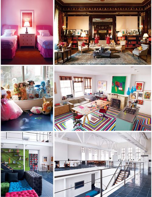
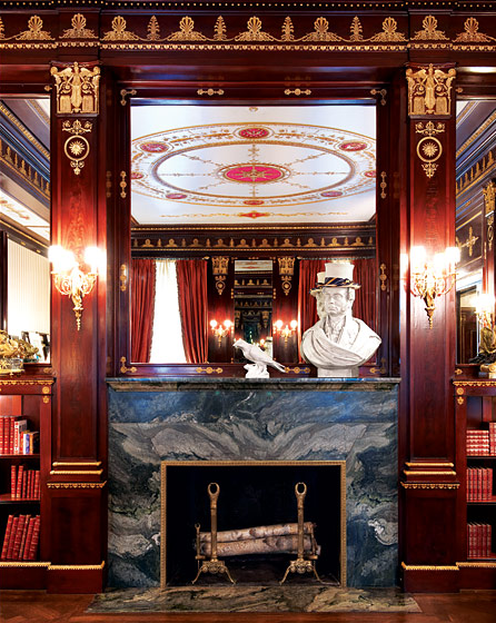
In the home of three-year-old fraternal twins Lulu and Bunny (pictured top), Elmo sits quietly on an occasional chair as tiny porcelain trinkets, pointy picture frames, heavy statues and tall thin table lamps threaten to take the little girls’ lives. Also, I have to wonder how many times a day someone has to pull Lulu and/or Bunny away from the beautiful vintage looking books lining the shelves at floor level. It’s hard to imagine that parents wth a velvet-covered tête-à-tête and a sterling silver tea set are more laid back than I am.
In Tim Nye’s apartment (pictured middle), I have never seen toys so artfully unarranged in my life. This is something I could never pull off with my baby’s toy collection. Granted, his ten-year-old is too old for the current centerpiece du jour in our living room—The Jumperoo. This aesthetic assault on the eyes is the home decor equivalent to the royal blue wall-to-wall shag carpet I had as a kid. Both hideous and impossible to hide. But even without the Jumperoo, I could have a single stuffed animal lying on the floor and the place would look like the cast of The Real World just got through living in it.
The only thing more envy inducing than Lulu & Bunny’s perfectly appointed adult decor and Tim Nye’s “Mess of Toys” masterpiece is the 5,900 square foot apartment converted from a former YMCA belonging to a mother with two daughters (pictured bottom). I’m pretty sure there are farms in Iowa that have less square footage. The kitchen counter space alone looks bigger than my whole apartment. If they had a party, they would need at least five bartenders to man that counter correctly. Looking at the massive potential for that amount of space is enough to make me want to pack my things and leave the city altogether.
That’s the thing that always gets me about New York Magazine’s Home Design issues. Each home inspires the kind of jealousy that makes me think I might not belong here after all. One look at these apartments and you know, these people are never going to have to make that horrible decision of when to leave the city and where to go. They’re not wondering if four people can live in a two bedroom apartment and struggling to understand school zoning laws. Nope— they’ve got it better. But at least I can feel secure knowing that if a porcelain bird were to ever fall off my gold trimmed marble mantlepiece onto my baby’s head, I would most definitely be within earshot to hear the screaming.












Should of been titled: “The ROYAL Family Edition.”
I love it! 🙂 Very well written.
Being myself a New Yorker, I’m surrounded by BS every day, and just like you, I really wonder what the heck I’m doing here?! 🙂 “Family edition”, LOL yeah right! :)))
Whose family? Donald Trump’s?
Hear hear on all of the above!
Looks kind of stupid to me… and I LOVE this kind of stuff. Missing a little bit of a heart.
Amen sister. This post brought you by a New Yorker whose 10-month-old son lives in a 7’x6′ “bedroom” that we built INSIDE our own bedroom.
PS: I’m actually a little envious of Mazzy’s room…
At least proportionally the baby fits just fine. I lived in a bedroom roughly that size when I was a full grown person of 25. Double bed smacked up to a dresser that you could barely open and that was it. No walking space, no closet. NYC living is rough.
I was born here so I guess I have my answer.
I know some of “these people.” She has total OCD. The kids take out a toy and she makes them put it back. They have one nanny for each of the three kids. And they’re complete assholes. So I personally think you’re in much better shape.
http://www.worldsworstmoms.com
I actually read this post before I found my copy of New York in a pile of unopened mail. I still haven’t read it–I’m too scared of the envy that it will light up in my soul. I was talking to my friends today…it’s so sad how we think the right pendant light will make everything just click into place for me. Sigh…
So true- even if I spend all my time and energy picking beautiful curtains, they are still going to be framed by my horribly office-looking hvac units. It’s hard enough when your dining room doubles as as your living room without it also doubling as your stroller parking lot.
I know this post is old, but have you watched the show “Selling New York” yet? I live in the D.C. area now and my last apartment in NYC was a studio in Chelsea. But I always am amazed that these same people were living right near me – all around me – in these insane apartments. If I could have lived like that, I’d have stayed forever! You have my total sympathies. I’m just glad I no longer have to keep my pots and pans in the oven.